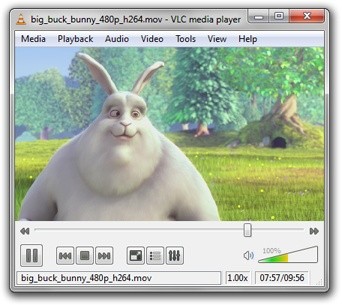
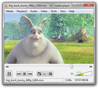
VLC gets uglier...

Versus

I love the streamlined ans simple design of the old VLC, don't the buttons on the new ones look so clunky and not streamlined?
Just like Folding@home's community response to the NVIDIA GPU project 5748, there is a consensus of dislike to the new interface. The discussion continues here.
I particularly like this post from the discussion:
"I don't need fancier controls or styles - if I did, I would have used a skin. It's all just in the way, quite unnecessarily. The design philosophy of the VLC was never to try to compete with the fancy-smancy commercial products with their increasingly convoluted interfaces - it makes me sad to see this change."
That is exactly how I feel about this. But hey... it now supports AVCHD so that's a plus. But man is it so ugly...
I'll be sticking to VLC version 0.8.6 until this changes...


0 Comments:
Post a Comment
<< Home